COUNTIES WITH HIGH COVID-19 RISK: SET #2
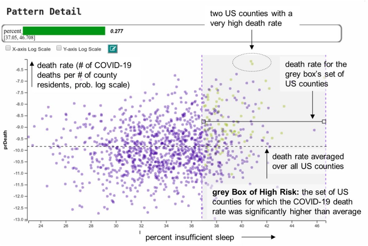
Zooming in: counties with insufficient sleep
In the visualization on the left each data point is a county and the placement along the horizontal axis is determined by the amount of sleep deprivation the county residents have. Per the US Center of Disease Control (CDC), from where this aspect of the data originates, adults need 7 or more hours of sleep/night for good health and well-being. The vertical axis is the COVID-19 death rate.
The grey Box of High Risk contains the counties where on average and compared to other US counties an unusually high number of residents died from COVID-19, in relation to the county’s overall population. The placement of the box tells us that a high rate of sleep deprivation (>37%) is common for these counties.
However, that’s not the full story: We see that the grey box has a mix of purple and yellow points, but only the yellow points are counties where high COVID-19 death rate is consistent. The green Bar of Confidence on top has just under 30% of the full length and the number next to it reads 0.277 accordingly.
This means that our risk assessment is still about 72% off. Not all counties with higher sleep deprivation rate are at higher than usual risk of COVID-19 death. We need to refine the pattern.
But we are on the right track. We do observe that there are only purple dots outside the grey box. That’s reassuring since it proves that our pattern mining engine did not overlook any county that is of interest for this specific pattern description (the yellow dots).
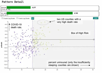
Zooming in further: sleep-deprived counties which are under-insured
Our pattern mining engine automatically refines the above pattern description by adding ‘percent (health) uninsured’ as a second feature. This constraint applies only to the counties part of the initial Box of High Risk. It is why there are fewer counties in this visualization now.
This sharpens our risk assessment to counties with a sleep-deprived population where 15% or more of its residents have no health insurance. The green Bar of Confidence now reads 77%. While we gained almost 50%, more work is needed to reach 100% — there are still some purple dots.
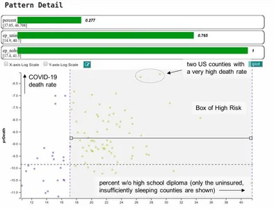
The final cut: sleep-deprived, under-educated counties with low participation in health insurance
The third automatic pattern refinement step leads to the final visualization on the left with the previous boxed counties ordered from the aspect of percent high school graduates. We observe that counties where the percentage of residents without a high-school diploma is 17% and above have on average a COVID-19 death rate above US average.
Our software places the Box of High Risk at the statistically correct margin. There are no more purple points in the box which means that our risk assessment is razor sharp. The bottom-most green Bar of Confidence confirms this; it’s maxed out at 100%.
Final takeaways
What we learn from this pattern is that counties where residents do not get sufficient sleep, are under-educated, and do not have health insurance are on average especially hard hit by the COVID-19 virus.
Likely the residents of these counties, due to their low education, need to work two or more low-level jobs that do not come with health benefits. Some of these jobs may even be during the night which exacerbates the lack of sleep.
What we do not know (yet) is why these factors affect a high COVID-19 death rate, but at least now we know where to look and explore to avoid this risk in the future. As such, the insights we gathered in our analysis are not the end but rather a beginning. They need to drive more studies and new policies in health care.