COUNTIES WITH HIGH COVID-19 RISK: SET #3
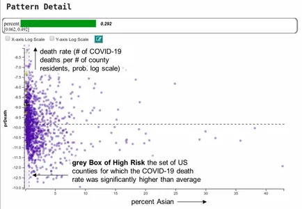
Zooming in: counties with low Asian populations
In the visualization on the left, each data point is a county and the placement along the horizontal axis is determined by the percent Asian population. The vertical axis is the COVID-19 death rate.
The very slim grey Box of High Risk on the left contains the counties where on average and compared to other US counties an unusually high number of residents died from COVID-19, in relation to the county’s overall population. The placement of the box tells us that a very low Asian population (<1.5%) is common for these counties.
However, that’s not the full story: We see that the grey box has a mix of purple and yellow points; however, only the yellow points are counties where high COVID-19 death rate is consistent. The green Bar of Confidence on top of the plot is about 30% of the full length and its value reads 0.292.
It means that our risk assessment is still about 70% off. Not all counties with a low Asian population are at higher than usual risk of COVID-19 death. We need to refine the pattern.
But we are on the right track: We do observe that there are only purple dots outside the grey box. That’s reassuring since it proves that our pattern mining engine did not overlook any county that is of interest for this specific pattern description (the yellow dots).
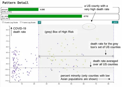
Zooming in further: low-Asian populated counties with a high percentage of minorities
Our pattern mining engine automatically refines the pattern description from above by adding ‘percent minority’ as a second feature. Note that we only added this constraint to the counties that were captured in the initial Box of High Risk. That is why there are fewer counties in this visualization now.
It sharpens our risk assessment to counties with low rates of Asians but a strong minority population (above 24%). Fittingly, the green Bar of Confidence now reads 71%. We are getting a lot better but we still have more work to do to reach 100% — there are still some purple dots.
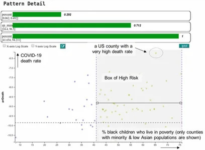
The final cut: counties with a low Asian but high minority population where black children live in poverty
The third automatic pattern refinement step leads to the final visualization. The boxed set of counties from above are now ordered from the aspect of the percentage of black children living in poverty. The grey Box of High Risk contains the counties where this percentage is above 41%.
There are no more purple points in the box which means that our risk assessment is razor sharp. The bottom-most green bar of confidence confirms this; it’s maxed out at 100%.
Final takeaways
This pattern is mainly about the population profile of the counties. It reveals that counties where the minority population is high and where black children live in poverty are on average especially hard hit by the COVID-19 virus. We also learn that these counties have a very low Asian population.
While the latter could indicate that awareness how to deal with a respiratory disease is low, some may say that these pattern descriptors appear somewhat over-engineered. Yet, given the complexity of the feature space this level of refinement might just be needed to separate high and low risk.
So if you live in such a county you now know that there are risk factors that make you more susceptible to COVID-19. What we do not know (yet) is why these factors actually effect a high COVID-19 death rate, but at least now we know where to look and explore to avoid this risk in the future.
As such, the insights we gathered in our analysis are not the end, but rather a beginning. They need to drive more studies and new policies in health care.