Examples of Akai Kaeru at Work Analyzing COVID-19 for the Public Health Sector
COVID-19 Analytics: Who Is at Risk? Who Will Be Next?
Back in May 2020, when the COVID-19 pandemic was just starting, we used the pattern mining engine of our software to analyze a prominent dataset with about 500 attributes, covering demographics, economics, infrastructure, etc. for all of the 3,007 US counties. The dataset is composed of a curated collection of over 200 publicly available COVID-19 related datasets from sources like Johns Hopkins, the WHO, the World Bank, the New York Times, and many others.
We were interested why some counties experience higher COVID-19 death rates — the number of deaths in terms of population size.
Our Findings Can:
- Yield a better understanding of this raging pandemic
- Assist local authorities in predicting future COVID-19 death rates
- Inform health policy on important correlations
- Help with the allocation of resources such as testing kits and stations
- Aid in targeted community information campaigns


Finding the critical factors that identify counties at risk
Our analysis reveals that it is rarely just one feature that exposes a county to a higher than average COVID-19 death rate. Rather, it is usually a combination of features that, when true at the same time, provide a vivid narrative of these fateful circumstances.
In most cases, the number of features required to sufficiently describe a pattern is just a few. This makes them easy to explain, leading to a better understanding of the hidden processes and relations. Essentially, each pattern is a knowledge facet told in the domain’s language.
In May, 2020 our AI algorithm automatically identified 297 sets of US counties. We found that 985 US counties were at high risk, and that Mississippi, Louisiana, and Georgia had the highest density of high-risk counties at a coverage of 80–90%. These numbers changed somewhat as the pandemic was raging on.
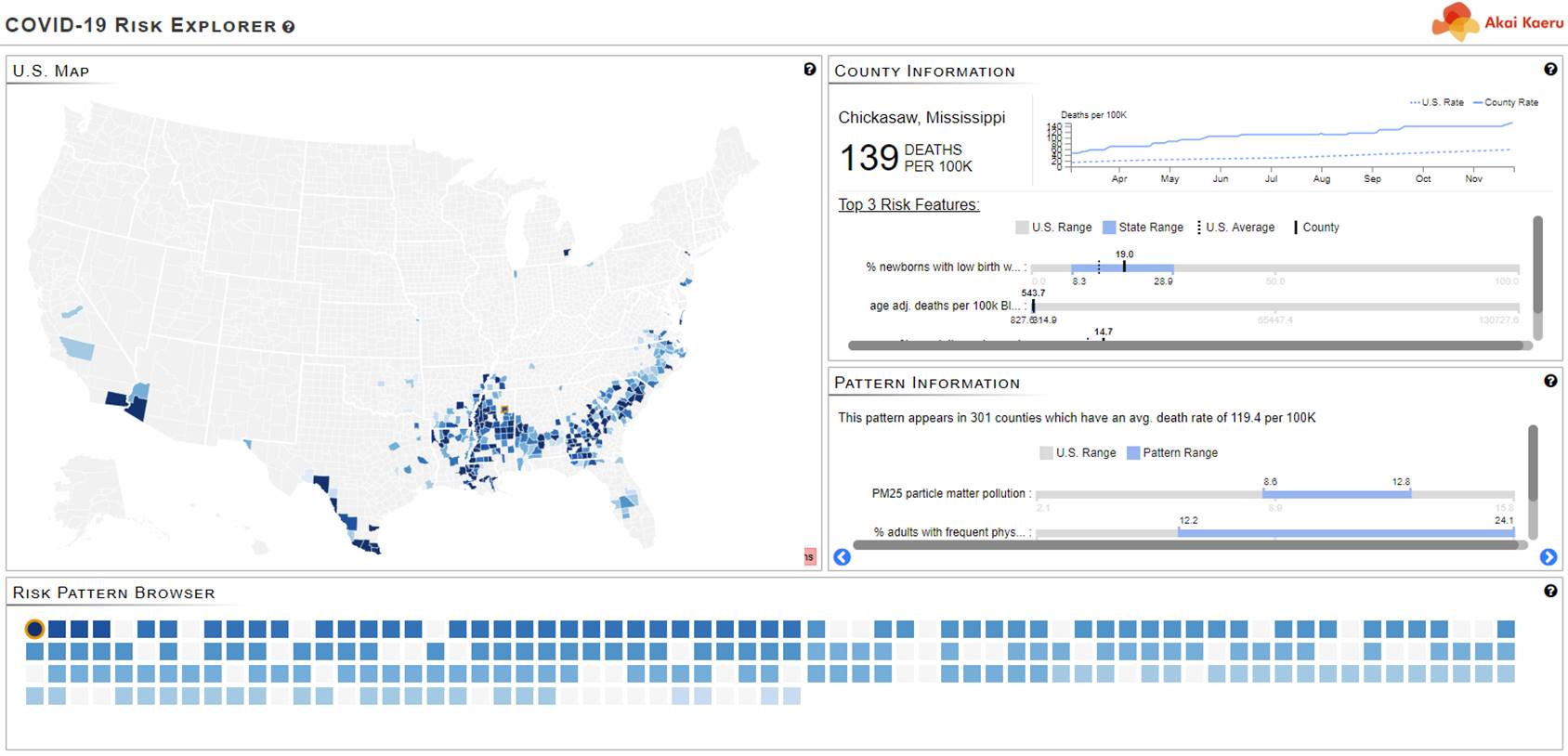
Our COVID-19 Risk Explorer Dashboard
Detailed Analyses of Some Example Patterns
In the following, we present three examples from the set of 297 patterns we found in our analysis in May 2020. We only considered counties that had at least one COVID-19 death incidence. Then we present two examples for correlation patterns, and finally show how well our patterns were able to predict death rates in later months.
This is a map of US counties that all have one thing in common: On average they have a higher COVID-19 death rate than all of the US counties averaged together. Follow this link to learn why these counties are at high risk. What else do they have in common?
Here is a third map of counties unified by a set of features that indicate an unusually high COVID-19 death rate on average. Click this link to learn what these critical features and their values ranges are.
Correlation Analysis: Finding Factors That Amplify Risk
Correlation can reveal a linear association between two variables, such as exercise and health. But important correlations are often hidden when data is subjected to conventional correlation analysis that uses all data points indiscriminately. Conversely, our pattern mining engine can reveal sets of data points (in this case, counties) where certain important correlations hold. When utilized by public health officials, it can enable more targeted COVID-19 testing and health policy-making.
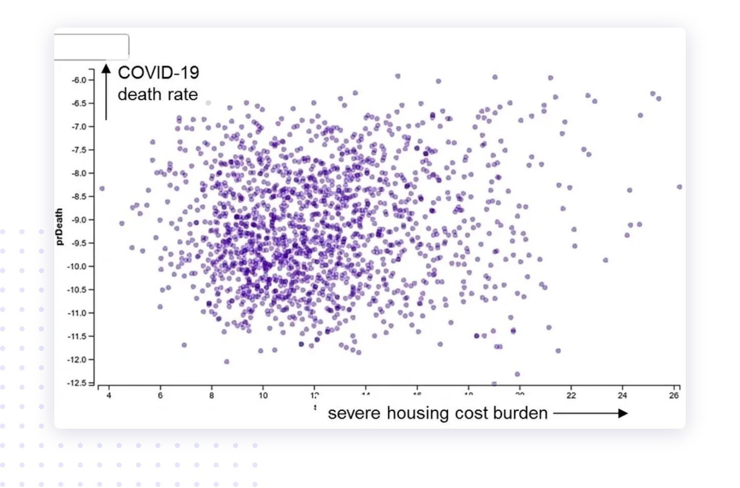
The scatterplot on the left might make one think that there is no apparent correlation between severe housing cost burden and COVID-19 death rate, as the correlation is a mere 10%. But in fact, there are county patterns where such a correlation holds. Click this link to find out what they are.

Identifying Counties That Will Be Impacted Soon
Akai Kaeru’s patterns can predict COVID-19 death rate
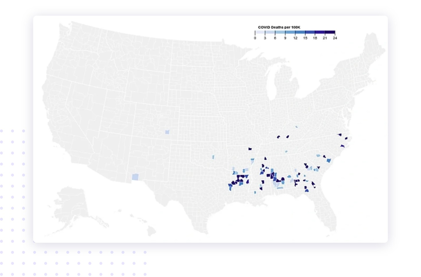
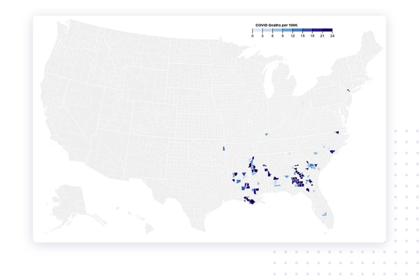
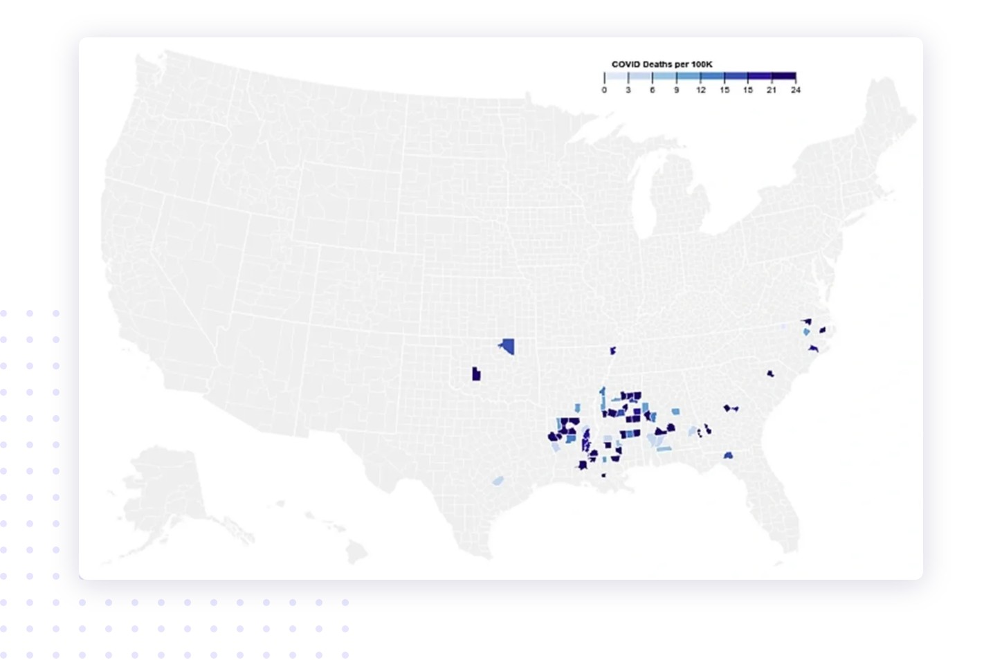
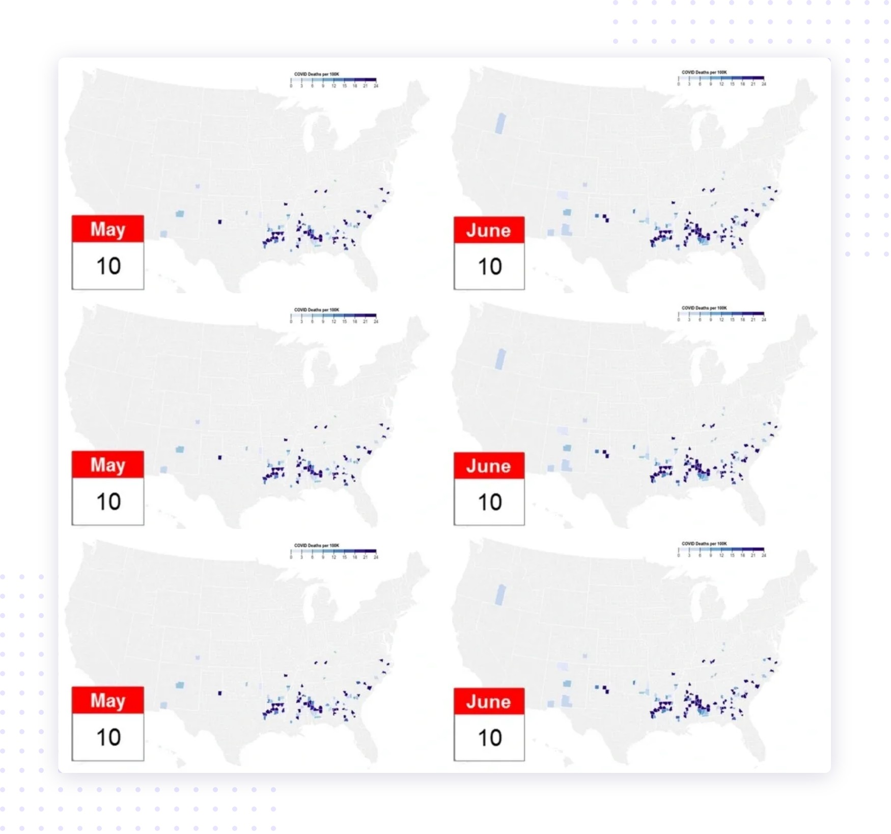
We followed the COVID-19 county data over time, and found that the pattern descriptions did not change much. We also found solid evidence that our pattern mining engine delivers statistically robust and reliable results. The three maps below show the three sets of counties, Sets 1–3, at the time of initial analysis (May 10, 2020) and one month later (June 10, 2020). In fact, our prediction stayed on track for later months as well.
We see that for quite a few of these counties, the COVID-19 death rate markedly increased. This is signified by the shallow blue turning to dark blue. Other counties that were previously not affected but fit the respective pattern profile have now seen their first COVID-19 fatalities. They were previously invisible (gray) but are now shaded in shallow blue.
This shows our software’s capability to predict a county’s future as the pandemic raged on. The three sets highlighted here were randomly selected from the patterns we found; we did not “cherry-pick” the best results. For all patterns, the average COVID-19 death rate increased 2–3 times the US average during this time frame. Click here to learn more.
The Bigger Picture
We can think of every US county as an (observational) experiment; each has certain characteristics that make it unique and similar to some others at the same time. Our pattern mining engine looks for regions in this feature space that are occupied with similar counties that all respond in a similar way to a given target variable of interest: the COVID-19 death rate.
The criteria that determine “similarity” are grounded in sophisticated statistical pattern mining, which is a core technology we market. It can be applied to any domain, not just to predict the outcomes for a pandemic disease. Contact us to find out how we can help you to find important features in your data. The data strongly suggests that we can help you.

Interested in learning more about our overall approach to pattern mining?
If you would like to know more about our approach to pattern mining in high-dimensional feature spaces, visit this page. It offers a basic introduction to the subject.