Examples of Akai Kaeru at Work in the Finance Industry
Akai Kaeru’s Explainable AI for Fintech Analysis
Our software can quickly identify the conditions under which features become important and then uncover the causal relations that connect them. First, our pattern mining engine identifies groups of data items with shared characteristics. These patterns are then passed on to our easy-to-use interactive Visual Pattern Explorer where analysts can inspect and act upon them. Use cases in Fintech include:
- Stock Market Prediction: Predict stock prices from past data patterns and current observations
- Fraud Detection and Prevention: Detect malicious entities that are trying to hide, but still have common patterns
- Credit Scoring: Assess credit worthiness by estimating risk for default based on past data
- Risk Management: Use past internal and external data to estimate risk and prevent future losses
- Personalized Marketing: Estimate a person’s group to suggest purchases or investments
Furthermore, our correlation miner will help you determine:
- Will a certain stock rise or fall, and what are the attributes and their ranges when this occurs?
- What are suspicious data signatures of possible fraud to inform on-site situational awareness?
- Will a loan applicant default, and what are the specific attributes/values I should look out for?
- What are the specific customer profiles (attributes and value ranges) to use in targeted marketing?


Identify Key Drivers of Return in S&P 500 Data
We took a data set including stocks in the S&P 500 to analyze monthly returns from January to February 2016. The goal was to identify the key drivers of return during this period. The data included over 25 features describing different aspects of the stocks (e.g., sector, volatility, dividend yield, etc.). The sector categories include Financials, Healthcare, Materials, Industrials, Consumer Discretionary, Consumer Staples, and Utilities.
We used AK Miner to identify groups of stocks for which returns were unusually high or low. These groups were statistically robust and defined by simple criteria (e.g., low Volatility and high Dividend). We then switched to AK Visual Pattern Explorer to view and further explore this information, as seen in the figures below.
Akai Kaeru’s XAI Dashboard:
The Feature Importance Chart (bottom left) reveals that Volatility (after Sector) is the most important predictor variable for Returns. Clicking the mouse on the Volatility bar in this chart populates the Group Bubble Chart (top left). The y-axis is the target variable, Returns and the x-axis is the selected predictor variable, Volatility. Each bubble represents a collection of stocks which have similar characteristics and for which Returns are unusually high (shaded green) or low (red). The opacity of a bubble reveals how important the x-axis feature (here Volatility) is in defining the bubble’s group. In this specific example, we can see a strong trend in which lower Volatility is associated with higher Returns. However, the opacity of the groups tells us that Volatility only becomes really important at its extremes.
The user can click on a bubble for further analysis of its respective group. This adds a dark outline to the bubble. The Group Summary on the top right panel then shows the corresponding detailed information. We learn that the selected group is described by low Volatility (i.e., Volatility <= 1.44) and high Dividend (i.e., dividend >= 2.32).


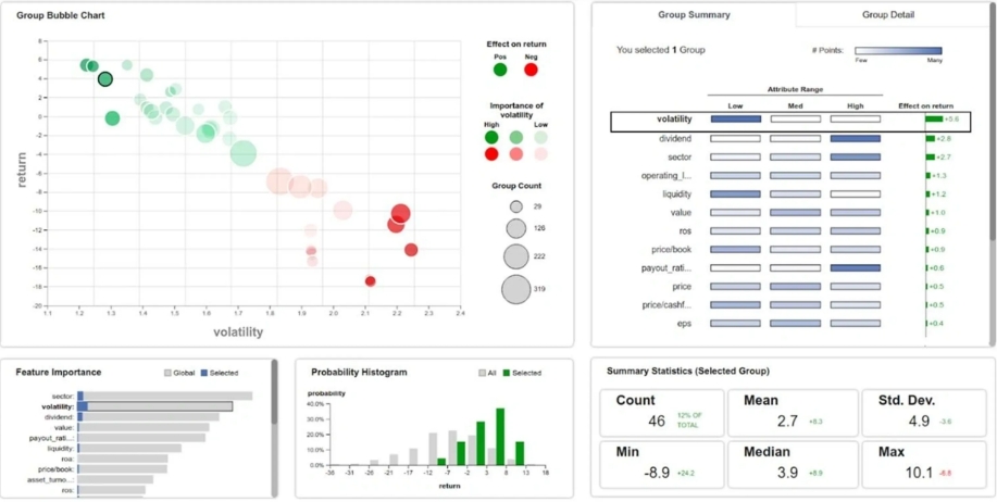
This is the same dashboard, now showing the Group Detail in the top right panel (selected by clicking the respective tab on the top). The three cells for each feature are colored by the number of stocks in the low, mid, and high value interval. It indicates the variable’s most dominant (if any) value interval in the chosen group of stocks. We can see that the values for Volatility are on the lower end, while the values for Dividend are on the higher end.
The green bar in the last column shows for each feature the strength of its effect on Return, which is positive for all features. If the effect was negative, it would be colored red.